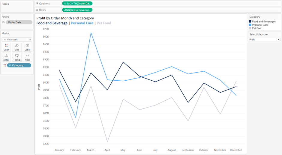
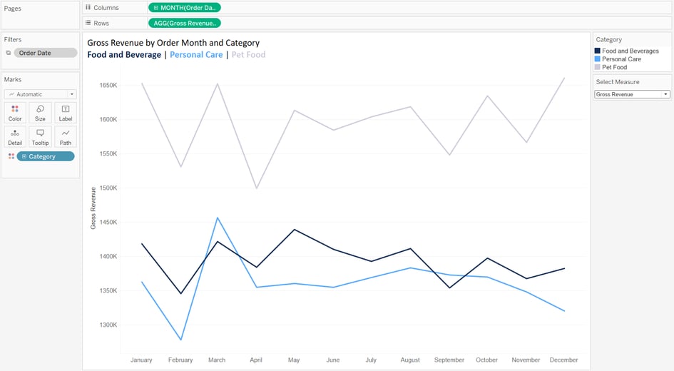
We have line chart of Profit and Gross Revenue vs time (timeline) for three categories. A select measure parameter is created to select between Profit/Gross Revenue
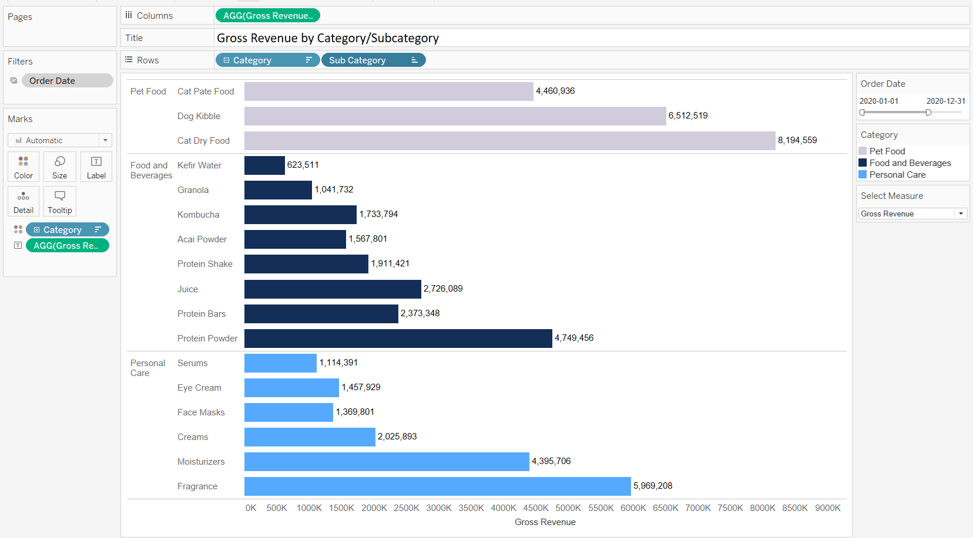
Bar chart of Gross Revenue by Cat / SubCat.
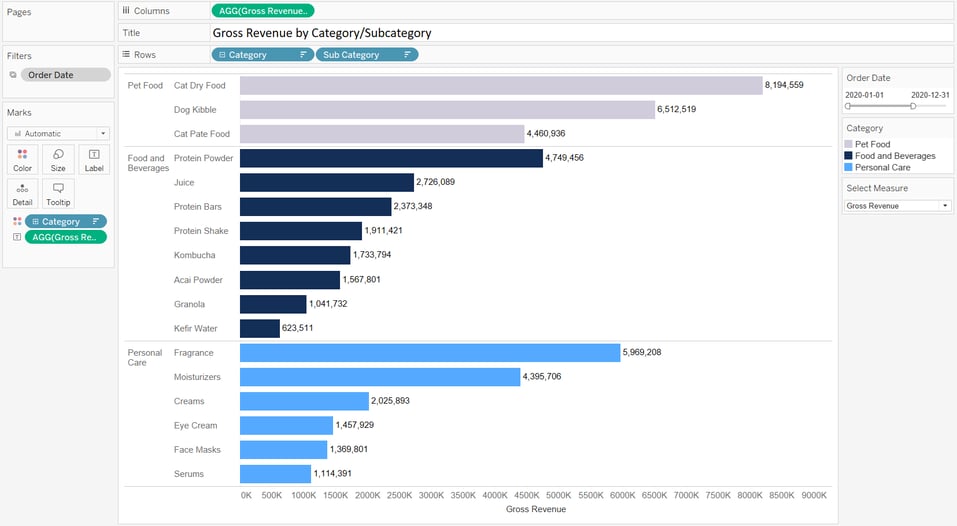
Category or Subcategory may be sorted by any fields. For example, Category by Gross Revenue in descending order while subcategory by Profit in ascending order.
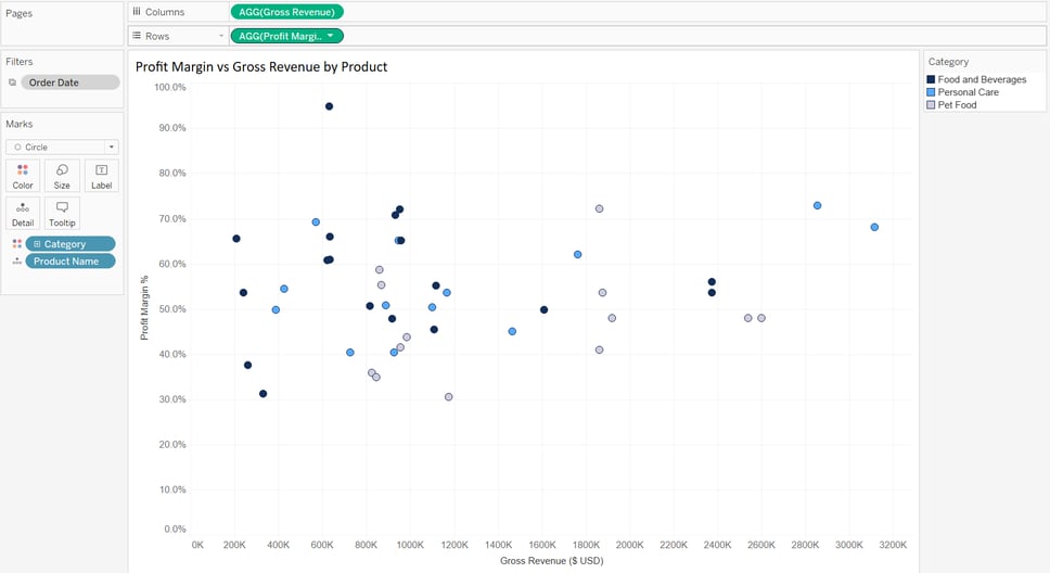
Scatter chart of Gross Revenue (X) vs Profit Margin % (Y) for three categories of products
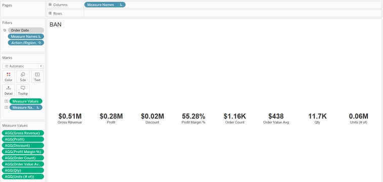
BAN (a.k.a KPIs)
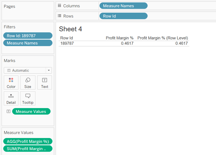
For a single row (Row Id 189787), Profit Margin % which is an aggregated measure and Profit Margin % (Row Level), return the same result, as there is no aggregation.
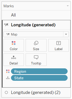
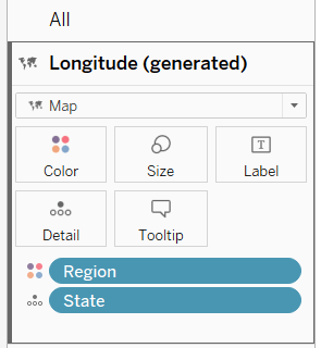
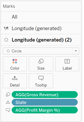
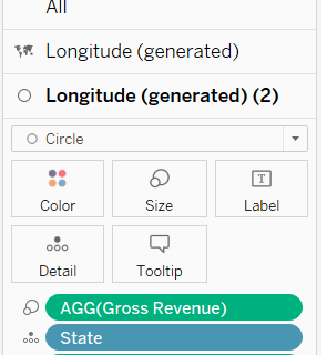
For the Map, we want the map colored by Regions while Gross revenue is as circle on the map. Therefore, we two two separate Longituded on the Marks Card. We also want the profit margin to be shown in tooltips.
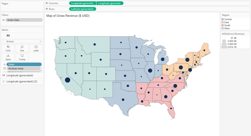
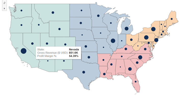
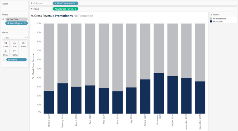
Stacked bars of % of Gross Revenue for Promotions and Non-Promotions sales by time is very useful. A table calculation (percent of total) is required. The visual is filtered for a specific State and for 2020.

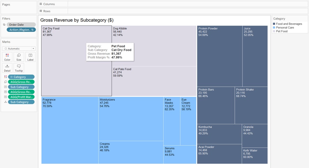
Tree Map of Gross Revenue by Subcategory.
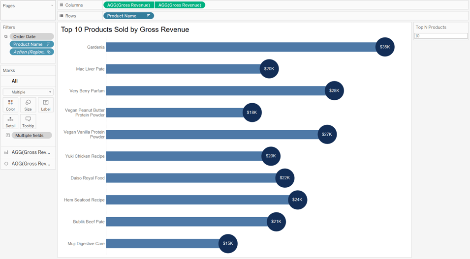
Lollipop of Top N products by Gross Revenue. N can be defined through a parameter. The bars can be sorted by any fields including Gross Revenue.
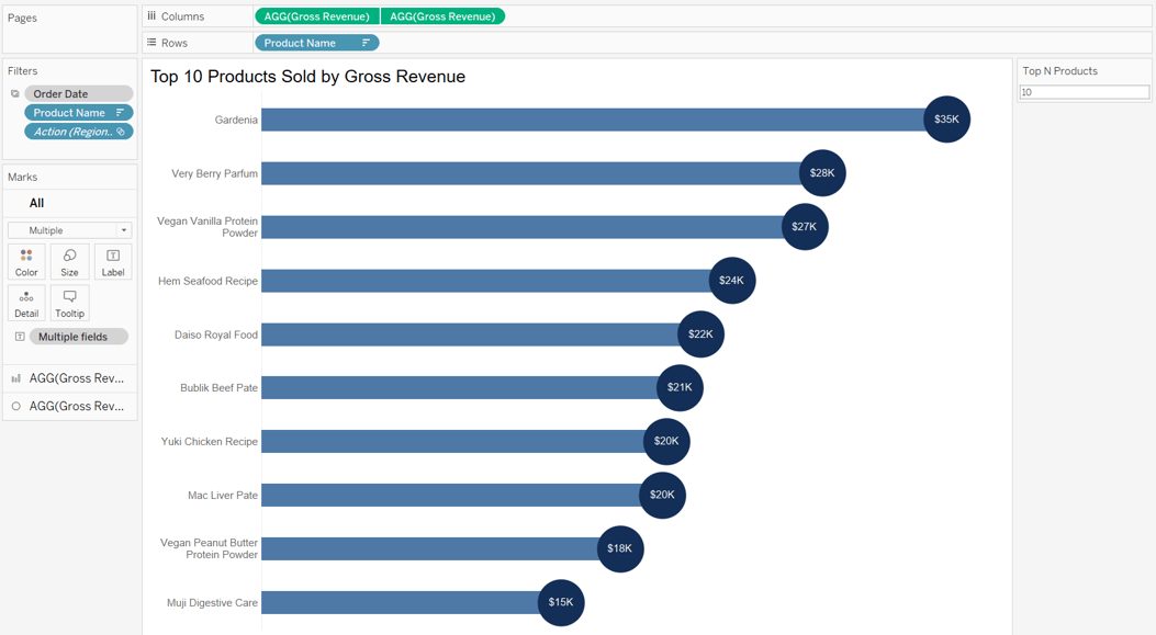
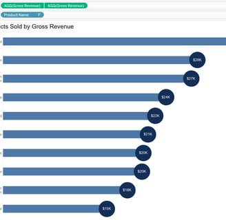
If the bars are sorted by Profit Margin %
