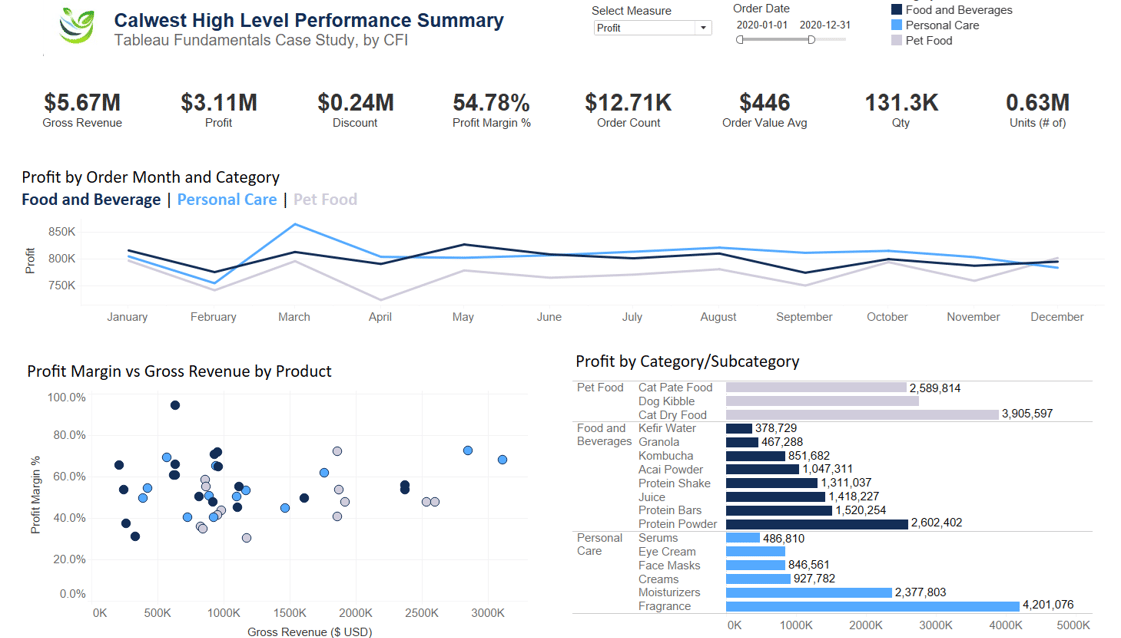
The Performance Summary dashboard is as the following. The dashboard has Select Measure parameter (Profit/Gross Margin) as well as date slicer and category legend at the top. It includes KPIs, line chart, scatter chart and bar chart.
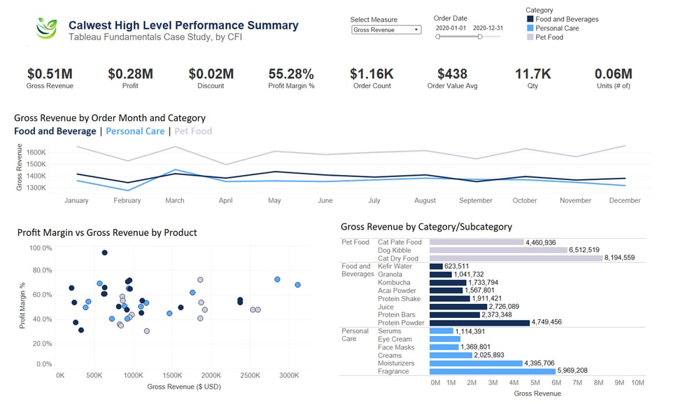
By changing the parameter from Gross Revenue to Profit and vice versa, the visuals respond.
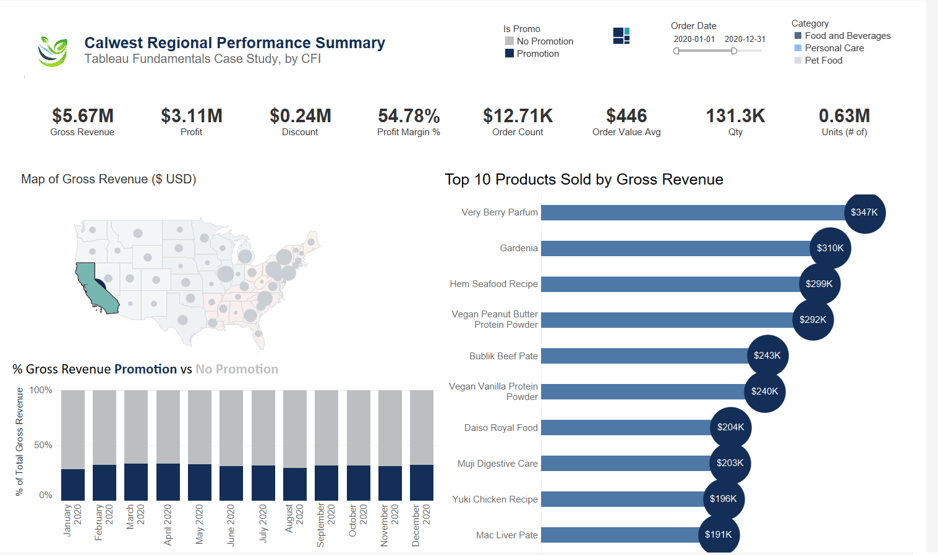
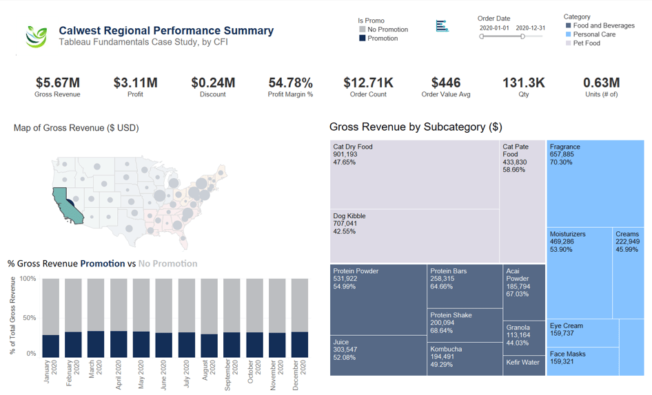
Regional Performance Summary has KPIs, Map, Tree Map, and Stacked column. Also, in the same container as the tree map, we have a lollipop visual. To switch between the two a button with corresponding icon is at the top.
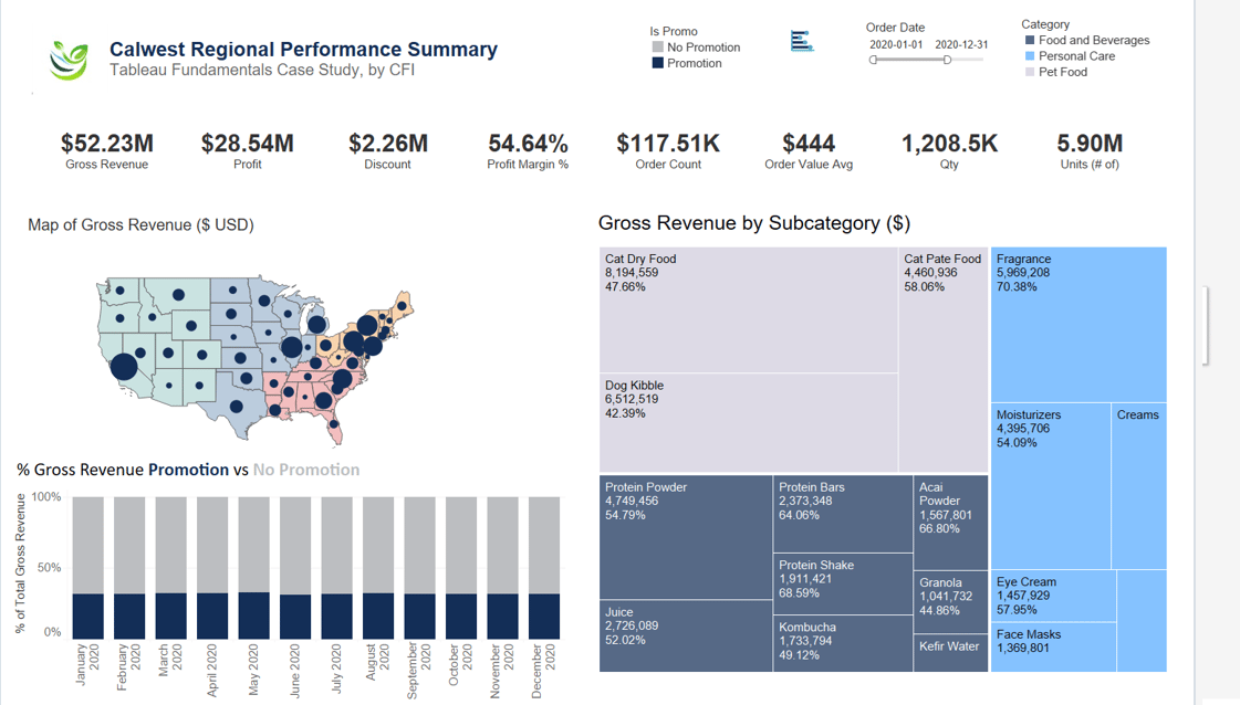
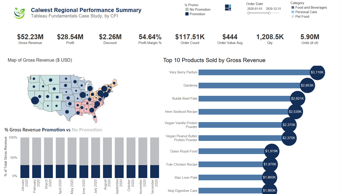
The visuals in the second dashboard are responsive to the Map. If California is selected, for example, the numbers are all filtered.
